
From websites to something as simple as a door handle- affordance is crucial.
No, this is not about money and low cost solutions for products. We’re talking about affordance in reference to UX (user experience).
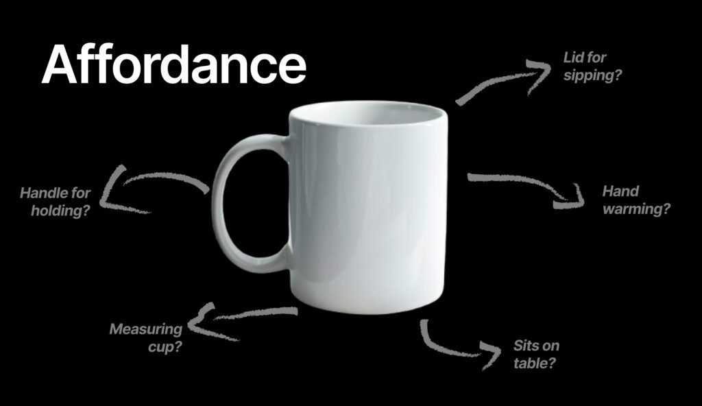
Affordance means the perceived properties of a feature that show how to interact with an experience or product. Affordance is about making a potential interaction for a user intuitive. Decreasing confusion and frustration by helping them understand how and when to use a feature or product.
Affordance is crucial for users to understand your product, digital or physical. From websites to something as simple as a door handle- affordance is crucial.
The term, ‘affordance’, in design was coined in 1977 by James J. Gibson and used in the context of physical design. Later popularized by a book called, “The Design of Everyday Things” by Don Norman which explored all versions of UX & design (digital and non).

Norman explored the shift of affordance toward a user’s perceived interaction, over the actual interaction. Emphasizing that the properties of a possible interaction must be clear and intuitive in order for users to understand what action triggering behavior is possible.

Small moments have a big impact. Without a trigger to signal a possible interaction, and signal how to interact with it, users don’t know if they can even start an interaction or complete it the intended way.
Leading to confusion, and frustration. There becomes a mismatched perspective on actions to take, and the results which leads to users being less likely to even make an intended interaction or even come back.
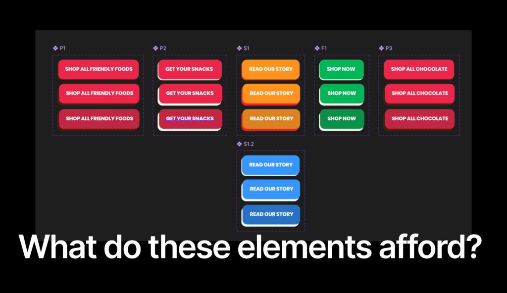
Some might consider these states in a digital product excessive, such as adding hover, selected and action completed. But if you sat down with all your users and asked them to choose between two interactions, which one do you think was more intuitive for them?
Questions to Ask Yourself
You can start small, you don’t need to create a giant masterplan to “fix” an experience (yet). Start with these three simple questions.
And if your answers start to sound like…
I am not sure if I do that.
I don’t know.
I don’t know what the signals are.
I don’t understand how to add visual feedback to an action.
Then we invite you to say hello to our team. If branding & quality UX is something you value.