
While some might imagine their design studio in a room with turtlenecks on, sipping espresso and talking about colors and vibes, it actually is a more systematic approach.
We love creating experiences that feel intuitive. But oftentimes when you hear the word ‘intuitive’, it maintains an air of mystery. What even involves making something feel good to interact with?
While some might imagine their design studio in a room with turtlenecks on, sipping espresso and talking about colors and vibes, it actually is a more systematic approach.
Let’s talk about a simple way to create a website flow that feels intuitive and great to interact with that takes from core UX principles and refines it to a single site experience. And of course this approach to follow will lead to increased conversions and likely outcomes.
Our process may not be like the traditional UX Flows you see in practice, but it is inspired by its process and outcome. As a branding & design studio, we’ve worked with many different businesses. We have unique clients with unique needs, and they aren’t always big tech looking to create a pristine UX Flow for their product.
Sometimes they are small business owners, or work with consumer packaged goods. Which means all usual tech UX practices have to be adjusted to match the user (client) needs (in this case, a website).
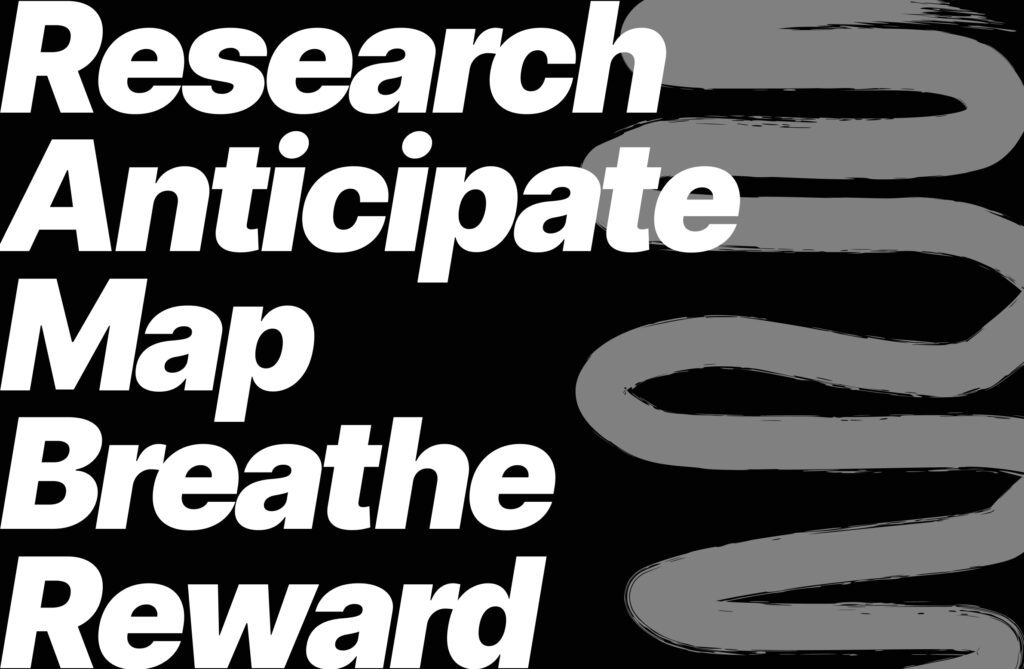
With any UX process, a core foundation will always be research. With a website though, research is a bit different than going to get user surveys. You have to research two key things instead as a start to building a good site flow.
Find out your top 3-4 competitors in your industry. But don’t go for the revenue match or the business size match… go for the ideal competitor. Who is outperforming you? Once you find 3 or 4, research their whole site strategy. Their flow, how they use their brand, how they communicate. What they do right and wrong and take notes on each page.
Once you’ve made observational comments on your competitor research- then it’s time to look inward. You need to research and create User Personas. There should be one primary user for your site, one ideal customer. The entire framework for the site flow will be based upon their persona (age, problems they face, what they are looking for, and their pain points with other competitors).
Now that you have a foundation in research, you are going to take everything you’ve learned and apply it to your site flow.
Now that you know your primary site user and their unique pain points, needs and expectations (based on what the best competitors are doing), you can formulate a flow that speaks directly to them,
Think about those needs, anticipate their emotions. Not just page by page, but section by section. What will they expect from you after the hero moment, and after you’ve shown them your services what will they likely want to see next?
You might be starting to understand how to create an intuitive site experience by framing it not from your perspective on what’s cool or works, but the audience’s perspective and hypothesizing real solutions for them.
Once you’ve created a site flow, and page flow by sections through anticipating their needs, emotions & expectations: you now need to map out their decision making moments.
We do this by color coding our complex site flows, by pin pointing when we insert an ideal outcome decision making section (or a CTA) and we map whether they are ready for that by the surrounding content. This helps us understand where they go from there, what mindset they have depending on where they convert and creating a follow up outcome to their decision making that makes clear sense to them.
You’re almost there, now you have to take a step back.
Take a day, don’t think about the site flow or UX flow. Come back to it and see where you’ve created what I like to call “Unearned Connection”. You can spot unearned connections by what you share within each section and how you follow up afterward.
Have you earned the right to continue blabbering about yourself? Why should they care? Is it pleasing to interact with?
Asking yourself these questions helps you understand where to create room to breathe. Sections that stop a flow and allow them to reflect before they move onto the next flow. This is about spacing and padding and colors, but it’s also about content heaviness and creating intentional connection with your audience based on trust-building content.
Once you’ve created breathing room within your site designs, now you have to remember: you are demanding their attention in a world where everything online demands it. How will you reward them for scrolling through your content on your site?
Sometimes we implement fun sections that make them laugh, reflect or feel like it’s not too serious. Maybe it’s a literal reward, like they get to find out the next product release of a business because we hid it like an easter egg.
The goal is to make these sites intuitive and smooth, and also fun and rewarding. Be grateful they’ve given you their time, now show it.
Using this framework, and thought processes you really can create a site that feels so intuitive to interact with that your conversion rate metrics, their time spent on your site, how many pages they visit and how many people come to your site will end up being beyond industry standard metrics.
We encourage you to take this, ask your agency or studio if they are willing to go a level deeper in their flow planning rather than just making whatever looks like it works.
You’ll find whether you’re working with the right partner for your goals, and also find that the outcome on your website is greater than you could anticipate. Rewarded, for trying.