
If you’ve ever scrolled through an incredible desktop web experience and opened it on your phone and found it to be slightly broken, chances are someone forgot to design and build responsively.
If you’ve ever scrolled through an incredible desktop web experience and opened it on your phone and found it to be slightly broken, chances are someone forgot to design and build responsively.
It’s not an uncommon experience for a client to come to us and say that the previous firm they worked with had not even considered how their design changes by device and screen size. “Designing responsively”, wasn’t even a thing our client knew they could request.
Some firms are designing and developing only for the size of the screen they are working on. This way they can produce websites faster. Resulting in broken websites and broken sections becoming everpresent online.
Responsive design is crucial, and matters more than that cool animation on your desktop.

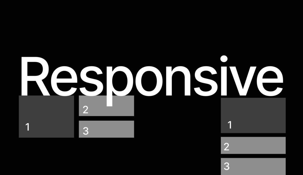
Responsive design is an approach to web design where the website layout, components & content adjust to each screen size to create a fluid user experience from any device.
Relying on key practices and tools in the design and development phase. For designers, we think about the style guides, components, grids and content widths of the site. Developers are thinking about clamps, flex boxes and css grids for different media queries.
These practices are made to ensure that the ‘feel’ and structure of the designs are being preserved across all devices without having to design new sections for every device size (more on adaptive design another time).

Reduces Section Breaking
No one wants to interact with a broken website on their phone, when it was just working on their laptop or desktop.
Especially if your website contains key actions for them to complete, but they are unable to do so on other devices they may have. Building responsive websites helps solve this problem.
Maintains Feel & UX
Responsive design & development ensures that the experience of your users is protected. Maintaining the brand feel and presentation across their devices ensures a positive experience for your audience every time (and not just sometimes on a laptop).
80% of People Are Experiencing Your Website on Mobile
Did you know that over 80% of people visiting websites now are doing so from their mobile device? This means now more than ever it is crucial to ensure that your website is responsive..

High Bounce Rates
You know that one metric that highly impacts your SEO rating, your sales & conversion metrics?
Yeah, that one.
Not considering all screen sizes results in anyone who is not on the pixel perfect version you created will be having a wholly different experience than you intended. Impacting how long they decide to stay on a site such as that…
Lackluster UX & UI
Needless to say, if your website is breaking on different device sizes- the experience of your users and the quality of the user interface they see is lackluster.
Consider icons that stretch too big because they are on a larger desktop, or cards spreading edge to edge because you forgot to add clamps on a wide screen. Buttons that double line, text that is too small to read, text that is so big on your phone you can’t even scroll… we could go on!
Bad Brand Feel
When you create an unfavorable experience for a user, do you think they associate it with just a website- or your brand as a whole? This is their first impression of you online, and if it does not match what you say you are, you’re creating a bad branding feel.
You could be the coolest kids on instagram, who can’t get anyone to fill out a form on your website.
Users Don’t Come Back
All it takes is one negative experience on your website, and 89% of them won’t come back… ever. That means the majority of your audience will never return again if you don’t serve them a quality experience that doesn’t break when viewing, and is easy to interact with.
Could you imagine a room of 100 qualified people, and because you did not consider responsive design and other screen sizes… 89 of them disappear and don’t even get to where they hear your pitch?
Responsive design isn’t merely an option. You may opt to save time and money now not having to do it, but you’ll pay for it in lost deals, bad brand impressions, and poor appearance.
You can do this! And if you’re a business owner- you can find people who care about this. Keep these items above in mind and take it to your next vendor.