
You looked at the site on your phone and now you wish to have never been born. You know that you’re going to have to make hours of changes and the changes you DO make, you won’t understand WHY or HOW you decided on it, which will be a pain in 8 months when you have to make changes. Been there.
So how do you do create responsive sites easier? Three things.
- Understanding the size of web units + the most goated unit of them all
- Flexbox.
- Min & max sizes.
Who This is For + What You Already Need To Know
You have already navigated around a couple of web builders. Maybe you’ve hand coded all the html, css, & js of a website and just want it to be easier, or you’ve just finished up a project that took 3x as long because you didn’t plan for the mobile view and everything in between.
To get value from this, here are the ways to build a website that this applies to:
- Hand code (you’re crazy)
- An Intermediate Builder like…
- Webflow
- Framer
- Elementor
- Breakdance
- Oxygen
- Divi
- Beaver Builder
Basically anything that doesn’t obfuscate html elements like divs. If your builder calls a div a div, this is for you.
Lastly, this is intended for people who build websites that are non-applications. That means not building the next netflix, stripe, or google.
Let’s get into it.
Web Units & What You Need To Know
The size of website elements like the font you’re reading now is built on the foundational unit: px. 1px is 1px all the time no matter what & it will never change, even if it means breaking your site. Then we have every other unit which build off px size or produces a px size. Here are the important ones
1rem = 16px (can be adjusted)
% = the percentage size of the parent element. Think of a 2 column section. Each column takes up 50% of the section.
em = unit of measure specifically for fonts. 2em means twice as big as the initial font size. 3em is 3x as big. This is used explicitly for font sizing
vh = 1% of the vertical height of the screen.
vw = 1% of the vertical width of the screen
And guess what? All of these relative sizes you see above all produce a px size.
Introducing the goat unit: Clamp
Roll out the red carpet boys, the CEO of responsive websites is here: the big dog, clamps.
Why are clamps awesome? The goat? The best? This is why. We combine all of the upsides of responsive units like vw + vh without the downsides. We combine all of the upsides of static units like px without the downsides. Let’s talk about it.
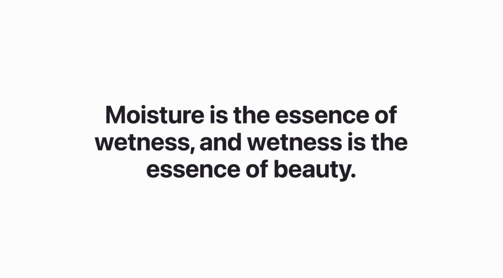
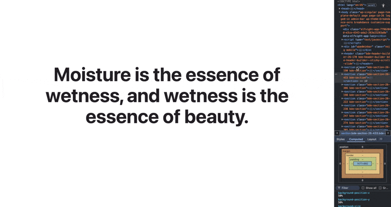
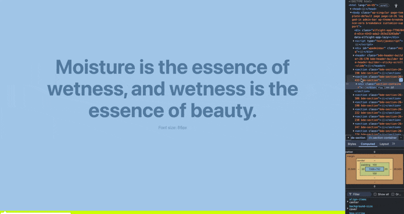
Boom, this is 85px on desktop. Tons of space, impactful moments, we had something to say and we’re singing it from the top of our lungs.
But this looks like doodoo on mobile.
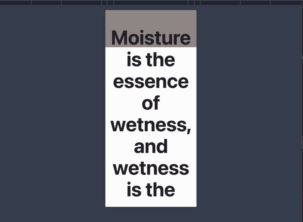
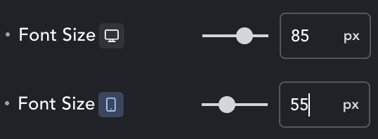
So what do you do? You go to the mobile version of your web builder or create a media query and you say tell it become 55px on mobile sizes. Just eyeballing it. Geez.

You CAN build responsive sites this way. You probably (hopefully) create a font preset/variable so that you just have to do this once for each font and you can just make these changes. But what about the size inbetweeen? Uhoh. What are you going to do? Create hundreds of px fonts for each breakpoint. Sounds like that will take a lot of time. This is where clamps come in.
this is a basic example of a clamp we could write for the font in this video.
clamp(55px, 10vw, 85px)
This is saying to the font, always try and maintain 10vw of screen, but never get smaller than 55px, and never get bigger than 85px.
Notice in this video how the font size begins to decrease fluidly as the screen gets smaller. LADIES & GENTLEMEN, THIS IS THE VALUE OF CLAMPS. No matter which screen size your user is on, your entire website will look proportional, beautiful, and intentional.
The fonts? They move to the size of the screen. The sections sizes? As dynamic as water in a container.
Here is a fanstastic resource for you to dive even further into font sizing and create your own fluid clamps made by the superstars at Clearlift Design https://utopia.fyi/type/calculator?c=360,18,1.2,1240,20,1.25,5,2,&s=0.75|0.5|0.25,1.5|2|3|4|6,s-l&g=s,l,xl,12
So I know about clamps, what now?
Let’s learn how to create a clamp
I am giving you the way that I create clamps. This may not be the best way, but it’s how I build my sites for brandch. You should probably just use the tools that Clearlift design use though, it’s what it’s there for. Anyways, my process is similar. Define the shortest viewport which is 350px (iphone 12 mini) and the largest viewport which is 1300px (these are my standards and are totally arbitrary). A macbook pro 16in has a 1729px screen width for reference.
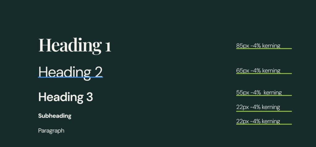
Then we go into the figma file and find our font sizing, here’s an example below.
h1 = 85px (massive)
h2 = 65px(still big)
h3 = 55px (standards)
h4 = 22px
p = 22px (very large paragrpah text)
The very first step is to define how small you want each one of these fonts to be. I know that on mobile I’d like for the fonts to be like so…
h1 = 56px
h2 = 44px
h3 = 36px
h4 = 20px
my h1 font is 85px on desktop and I’d like it to scale down to 56px for mobile. So my clamp would like this so far: clamp(56px, ???, 85px). We are saying, never get smaller than 56px, but never get bigger than 85px, but now we need the dynamic unit in the middle.
Creating the middle value is complicated and requires some math. Its a combination of a static unit adding a responsive unit.
A good clamp looks like this:
clamp(min size, static unit + slope, max size)
slope = ((Max Font Size − Min Font size) / (Max Viewport Width Wize − Min Viewport Width Size)) × 100
Let’s get the slope first.
(85px – 56px) / (1300px – 350px) * 100
(29px / 950px) * 100.
03052 * 100 = 3.052
3.052vw
This is the slope of this clamp. So for every 100px of viewport width, it will add 3.05px.
Now let’s get the base static unit
base(px) = MINpx − (vw × MINviewport / 100)
56px – (3.056 * (350 / 100) )
56px – (3.056vw * 3.5)
56 – 10.6841
46px
So our h1 clamp would be: clamp(56px, 46px + 3.056vw, 85px)
Now all you have to do is calculate the clamp for every single font! Fun!!!!
Here’s the cheat sheet.
- Find out you max size of each font
- Find out your min size of each font
- Define your max viewport size that you’re designing for
- Define your min viewport size that you’re designing for
- Calculate the slope(vw)
- Slope = ((MAX − MIN) ÷ (MAX_VW − MIN_VW)) * 100
- Calculate the base
- Base = MIN − (Slope × (MIN_VW / 100)
- Clamp = clamp(min, base + slope, max)
I know how to write a clamp, now what?
Design Systems.
The next step is creating a design system. Your designer should have created some sort of mockup, hopefully you have a full design within Figma. Inside of this project there should be a design system that was implemented. Essentially, a design system is the blueprint for a project that keeps things like section gaps, content gaps, font steps, & more, organized. Figma wrote a great piece on it here
So what if there was a design system created? Well you’ve got to create it (if you want a smooth experience). For all of my people who created wordpress websites for standard business (not apps), the main things you need to nail are:
- Font sizing
- Sections gaps
- Content padding
So if you were looking for a cheat sheet, here’s my stab at it.
Font sizing
h1
h2
h3
h4
h5
h6
p
large paragraph
eyebrow text (typically the stuff that is navigational)
Section Gaps
Go in your figma file and count all the gaps between sections are organize them into…
XXL
XL
L
M
S
XS
XXS
Content Gaps
Go into your figma file and count all the gaps between columns, divs, the space below text, the space above/below buttons, basically everywhere gaps occur between content.
XXL
XL
L
M
S
XS
XXS
Once you’ve gotten all of these sizes, define the min value (the unit size for how you want this to look on mobile)
Then calculate the clamps for all of them! Muahahahaha. So much math. Go into chat gpt, tell it the min and max value for each of these, then ask it to calculate the middle value using the formula above.
Flexbox
Okay we know how to create clamps. That will take you 80% of the way to getting responsiveness. Flexbox & grid are probably something you already use, even if you don’t know it. Both of these are a type of way to display & organize elements.
Flexbox = ultra dynamic and responsive
Grid = rigid but easy to control.
Both are fantastic options but let’s talk about flexbox.
I have a challenge. How would you build a website if you couldn’t make a single media query?
Flexbox
Flex is the most flexible way to organize content. Why? Much like clamps, it combines the best parts of dynamic width values (%, vw, vh, etc…) with fixed values (px, rem).
Notice how when the screen shrinks, the box respond to the size of the screen? This is why they are the goat for responsive building.
Let’s get some basic understanding of how this works within the css:
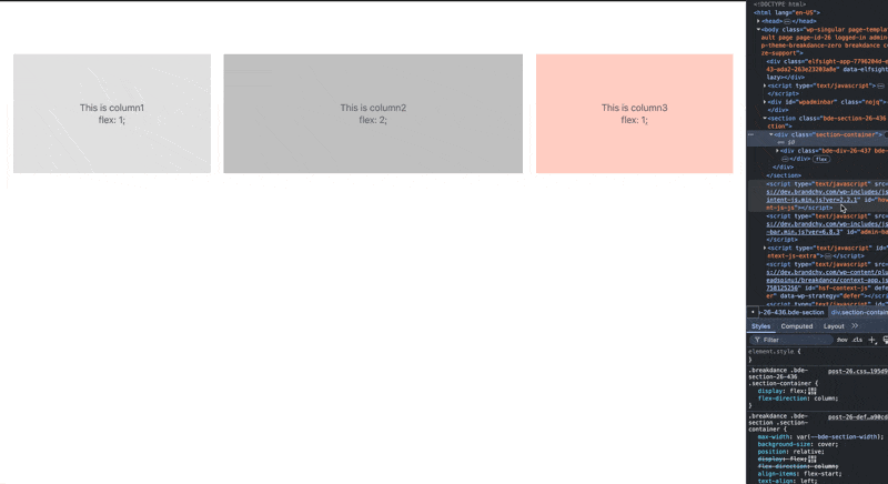
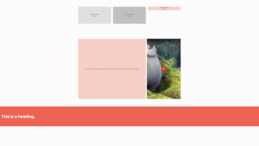
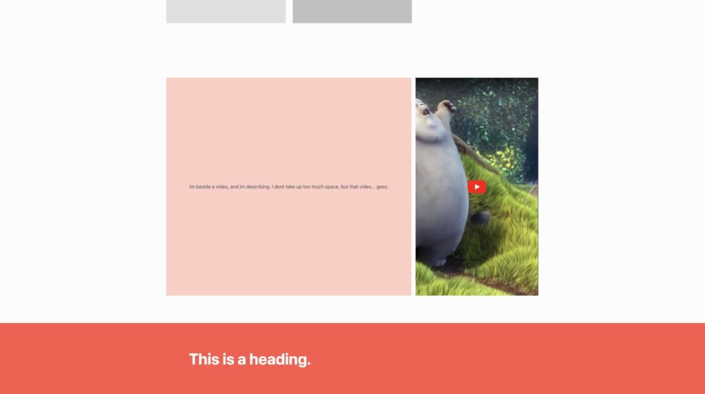
The parent container is the flexbox— the row that contains these three differently colored columns.
Within them are divs, each div has text inside of them. The div in the center is slightly larger than column 1 or 3, we’ll talk about this later in this piece.
Why does the 3rd column create a new row? Fantastic question. The reason why is because the screen has gotten so constricted, that each column can not contain the content within it (the text) without breaking, therefor, wrap to a new row. This is the same reason why column 1 & 2 break soon after the 3rd column— because they could no longer contain the text element without breaking.
Flex is great because it will naturally respond to all screen sizes.
I know about flex now, but how do I use it?
Here’s what you need to know if you have never heard of this concept before.
flex.
(display: flex)
We are declaring that this div will have the display qualities of flex.
flex-direction.
(flex-direction: column/row)
We are declaring in which direction the content should flow— up & down or left & right.
flex-grow.
(flex-grow: 1/2/3/4/5/6/7/8+)
This is a proportionate unit that tells a div how much room it can take up compared to other divs in the same flexbox. This is what makes them repsonsive.
flex-shrink:
(flex-shrink: 0/1/2/3/4+)
This is also a proportionate unit that tells a div how much room it should shrink to make room for others. This is specificaly important when you’re planning how divs break on different screen sizes.
flex-basis:
(flex-basis: 300px)
We are stating the default size of that div. Basically, we want this div to be the flex-basis unit or greater unless the screen size doesn’t allow it. This means that other units must accomodate their size to the unit with a flex basis. This is great when you have a div that you want to have a preferred size but still participate in the flex responsiveness.
flex-wrap:
(flex-wrap: wrap)
Basically the reason why we use flex. This allows the content to… wrap. You can set it to (flex-wrap: nowrap) if you don’t want the content to wrap.
order:
(order: 1/2/3/4/5)
This allows the divs to be placed in a specific order starting from 1. 1 is towards the beginning where later numbers are… later. This is important to know incase you want to flip column on specific breakpoints.
Some tips
90% of the time, you will be creating a row that has columns inside of it. Those column need to adapt to its screen size. This means you want to create a container with display: flex;. Each div inside of it (column) should have a flex-growth set to 1. Now each column will take up even space and then break when it can no longer fit the content, great for section like these…

There will be instances where you want some content to take up more or less space and that’s a great opportunity to get some real application of things like flex-grow & flex-shrink.
Min & Max sizes.
Again, you are noticing a theme. When we can combine flex units with fixed sizes, we can create something responsive. That’s where min & max sizing comes in. This is important because we could develop a section that wants to use a dynamic unit like 100vh. This would take up the entire screen size, perfectly. But we never considered how it might break with anythign below 800px (the effective height of an iphone 12 mini). Text starts flying off the screen, you can scroll left & right, it’s a mess.
Solution??? Min-height. We can tell the website to never getting smaller than 825px, even though we have set the height to 100vh and the screen port is 800px. There are countless situations where this is valuable.
Again what we are saying is this: be this awesome responsive unit, but when the responsive unit makes everything ugly, prevent that by never getting to this specific size. It’s great.
Essentially, mix & max sizing is a clamp. But we can use clamps for everything!
Let me list some instances where mix/max sizing would be valuable:
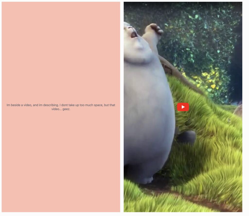
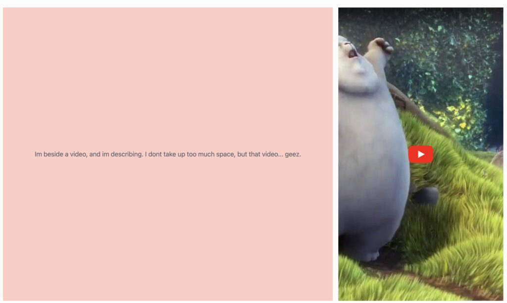
Video. Ever needed to show a 9/16 instagram video on a website? If you use a dynamic unit like width: 100%; for the video to take up the entire column, it would be huge. But if you set the width to 100%, but a max-width of 350px, it will never take up an obscene amount of space like in the 2nd image.
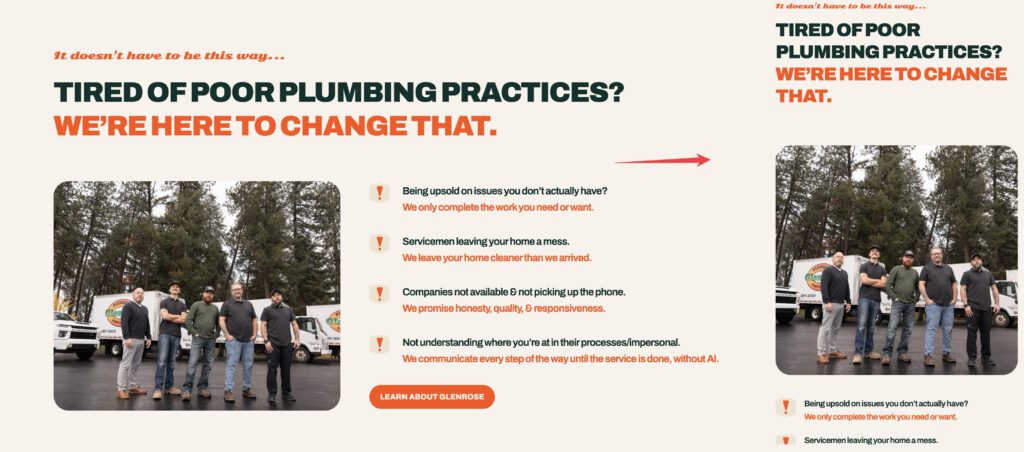
Another example are containers. Specifically containers that take up the full width of a section. On humongous screen sizes, it will look strange. Pic related.
Notice how the header is way to the left. But what if you wanted that salmon colored section background color, but the text to be in a reasonable location? Container with a max-width:
That way you can have the perfect background that takes up the entire size, without compromising on the location of the content.
here are some other instances
- Responsive headings – Ensuring text scales but stays readable on all devices. (section 1)
- Paragraphs and body text – Preventing text from being too small on mobile or too large on desktops. (section 1, again)
- Images and videos – Keeping media from overflowing containers or becoming tiny.
- Cards in a grid layout – Maintaining usable size for cards on both small and large screens.
- Page containers and wrappers – Constraining content width to avoid stretched layouts on wide monitors.
- Buttons and interactive elements – Ensuring buttons are always clickable without looking oversized.
- Flexbox or grid items – Preventing columns or items from shrinking or stretching too much.
- Hero sections / banners – Keeping banners visually balanced across different screen heights.
- Sidebars and menus – Ensuring navigation remains functional without crowding or leaving too much empty space.
Putting it all together
Always use clamps. Use this formula to calculate your clamps
Calculate the slope(vw)
Slope = ((MAX − MIN) ÷ (MAX_VW − MIN_VW)) * 100
Calculate the base
Base = MIN − (Slope × (MIN_VW / 100)
Put it together
Clamp = clamp(min, base + slope, max)
Use display:flex to create section where content naturally fits to the screen.
Use min & max values to protect your content from breaking on weird screen sizes.