Get In Touch

Paperoute

Changing the financing landscape through human-centered design.

Tackling a website redesign for a SaaS company doesn’t have to be tricky, it just has to be uniquely itself and human-centered. A new approach to fintech that doesn't have to feel intimidating for real people.

Full Services Provided

Paperoute is an incredible soft-credit check reporting software for businesses who run in-house financing. But with a unique model, a combination of monthly subscription cost and the capacity to add more 'Paperoutes', we were tasked with working on how pricing functions, as well as how to create a funnel that works.
Strategy & Consulting
Paperoute's previous logo felt too technical, and lacked character. With such a name that revokes old school mail paper routes and office work, it became crucial to adapt the logo to reflect said character.
Logo Design
The website was the key service Paperoute came to us to help them with. How do we create something that explains clearly what this software is, who it helps and how to get started in a highly branded way.
Website Design
Following standardized web practices, with our usual fun twist of a unique custom aspect that only this business can have. From fun feature animations to custom pricing sliders to explain token based subscription models.
Website Development

Process Breakdown

Before we begin any part of the project, we need to undestand the heart of Paperoute outside the lens of just 'SaaS company'. From learning Mike's, the founders, reason for even creating the software: seeing the lenders remove control from small business owners who want to know what makes someone qualified for services. To learning the meaning of powerful brand signals such as the green, yellow and red stoplights in the logo. From here, we begin strategy.
The Human Branding Framework
Paperoute had a pricing model that reflected complexity over easy understanding. You didn't know why one subscription level was better than the other for who. Our task was to create signaled names of each tier, explain who they are for and what features come with, as well as create token models and math that connects so users can understand what they'd pay before they ever enter a demo. Speaking of demo's, creating a funnel and page that allows people to easily schedule without limitations was crucial.
Pricing Strategy & Funnel Strategy
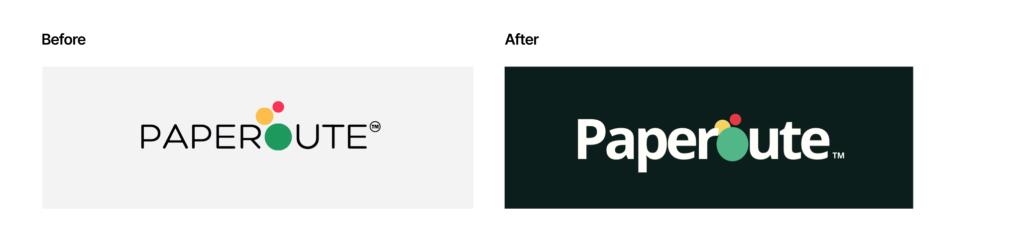
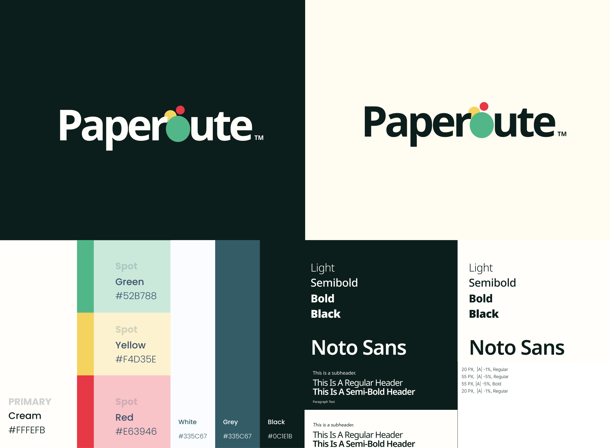
The previous logo was not bad, it just didn't reflect the true character revealed within the Human Branding Framework call. After learning the beating heart of the brand and learning what connects it to others, we knew we had to just slightly tweak presentation. Opting for a more bold, simplistic approach, to build person-ability. Building on top of already there brand signals of red, yellow and green, but elevating it and helping it follow logo best practices on spacing.
Brand Guidelines & Logo Refesh
From sitemaps to colored user flows, to the design itself. It was crucial to create a site strategy and design that reflected very human touch points to contrast to the norm of purple gradients and super tech-y feeling SaaS companies. This is about helping real people in their businesses, and showcasing that through catered language to ICP's, clear service explanations and the inclusion of real people versus just software feature highlights.
Website Design
Developing the site meant adding motion and feel to sections to help create impact. From simple animations to more complex pricing sliders, development was it's own experience that makes Paperoute's website uniquely their own.
Website Development

Up Next

Service Business
Norton Consulting
Insurance consulting focused on redemption and healthy lifestyles, breaking barriers for the burnt out and undervalued.

Branding

Design

Logo Design

Web Development

My experience with Brandch has been nothing shy of excellent. They are professional, polished, and results-driven, but in my opinion their greatest asset is their seemingly limitless creativity.
Abigail Bradeen,
Gravity Jack.
What stood out most? They really listened. Not only did they grasp my vision, but they also offered insightful suggestions that elevated the project in ways I hadn’t considered.
Robert W. Henry, Haven Realty Owner & Lifecoach
Their attention to detail is unmatched and the end result was A1.
Juandiego, Rep. of CNGC
Their team's professionalism, creativity, and dedication to a variety of strategies have exceeded our expectations.
Mark Buche, Gravity Jack
Read Our Google Reviews
My experience with Brandch has been nothing shy of excellent. They are professional, polished, and results-driven, but in my opinion their greatest asset is their seemingly limitless creativity.
Abigail Bradeen, Gravity Jack
What stood out most? They really listened. Not only did they grasp my vision, but they also offered insightful suggestions that elevated the project in ways I hadn’t considered.
Robert W. Henry, Haven Realty Owner & Lifecoach
Their team's professionalism, creativity, and dedication to a variety of strategies have exceeded our expectations.
Mark Buche, Gravity Jack
Their attention to detail is unmatched and the end result was A1.
Juandiego, Rep. of CNGC
Read Our Google Reviews