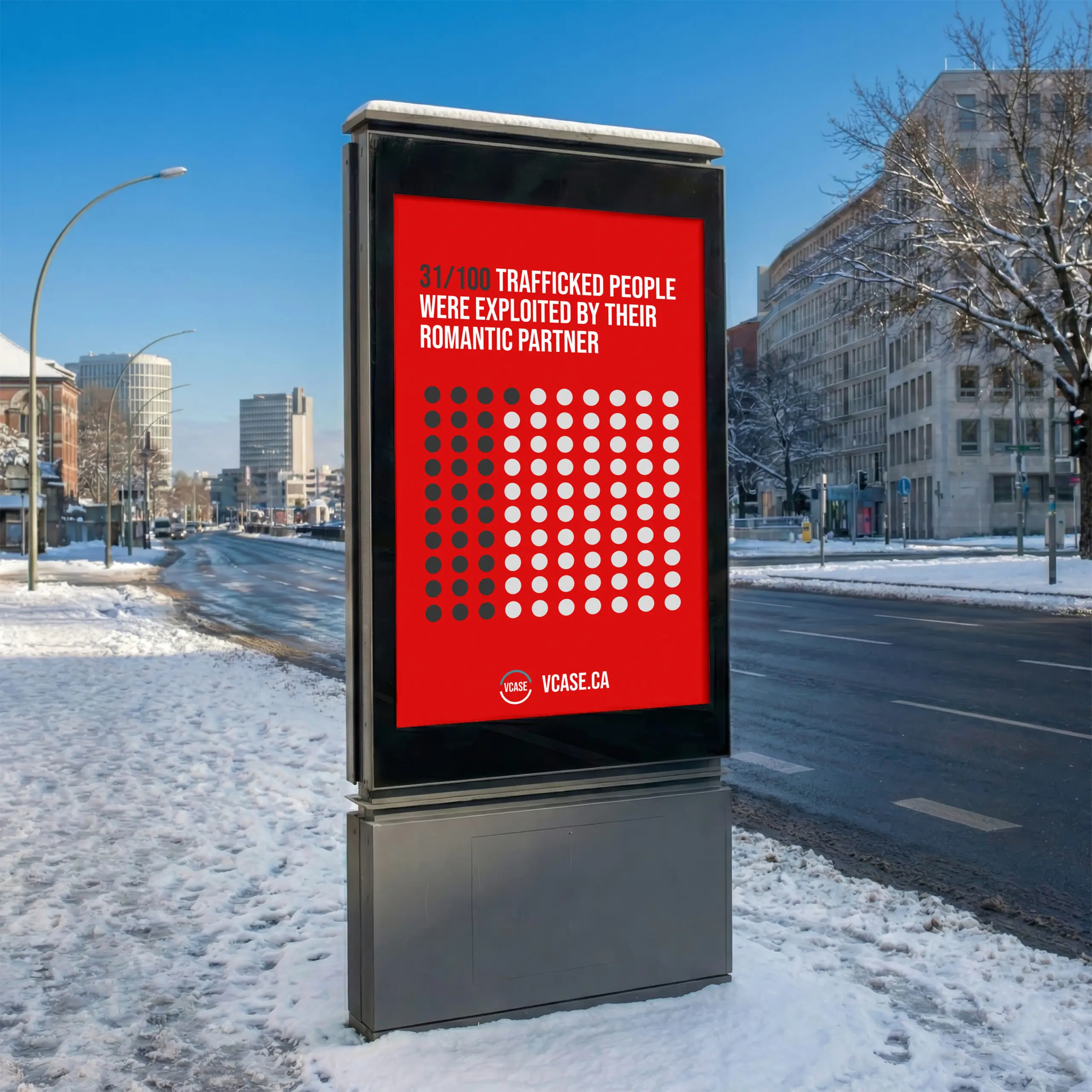
We knew that for a collective focused on ending exploitation of women and children, and marginalized groups such as indigenous women, it was important to not create a tacky logo or identity that uses iconography to symbolize the hurt. Simplicity was the goal, clear and effective, bold when needed.