Get In Touch

Cali Fleet Pros

Branding a company focused on helping fleets stay compliant in California to keep commerce flowing.

Cali Fleet Pros is a brand forged by deep story and a founder with a passion to serve. Keeping fleets compliant in California's changing landscape is a complex task. We created a brand system rooted in strength, stability and beliefs that can provide relief for their partners.

Full Services Provided

We were asked to carefully rebrand and create a new logo for Cali Fleet Pros. A brand that stands for California, its fleets and truckers, and the bumpy road of compliance needs a logo to stabilize the feeling of that journey. Inspired by fleet tire spokes and windy roads, California sunshine & ocean, we created a proportionate icon and custom font for their brand logo system.
Logo Design
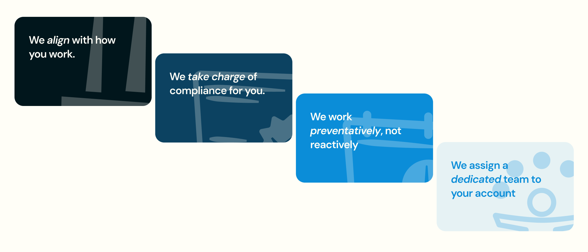
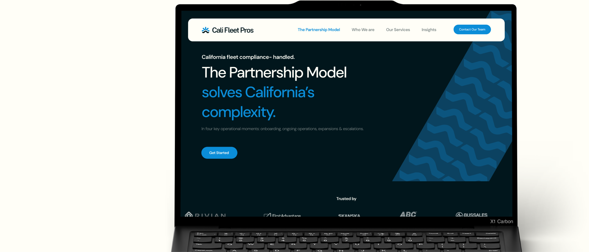
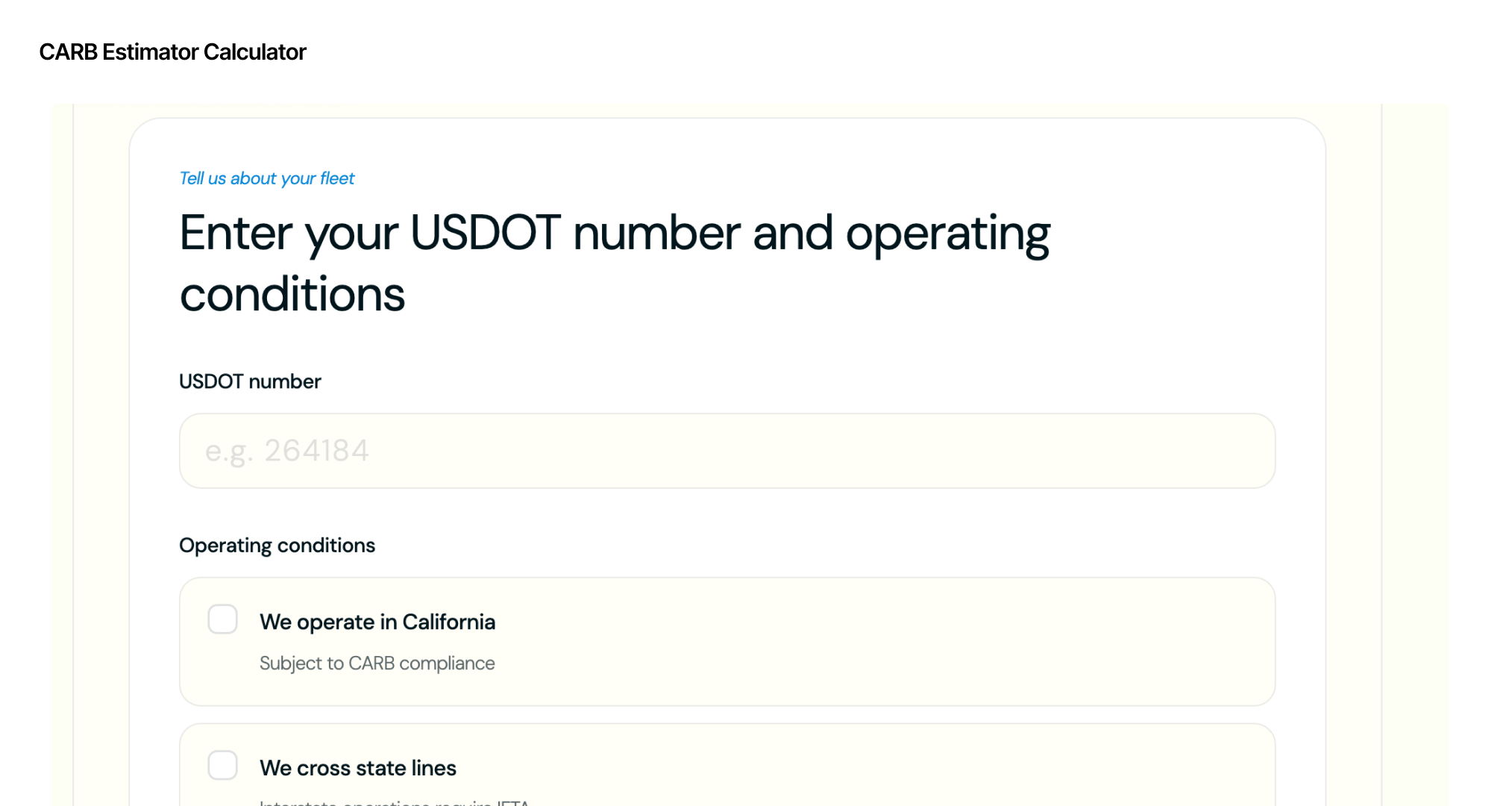
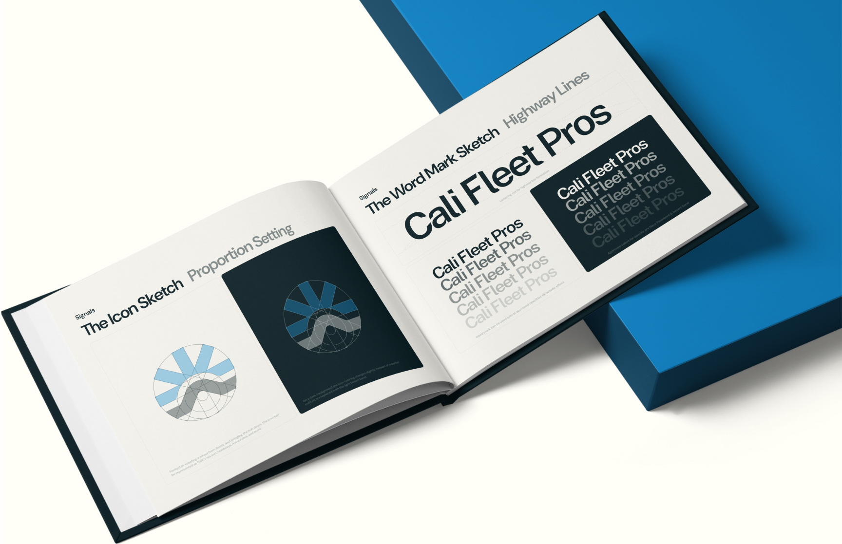
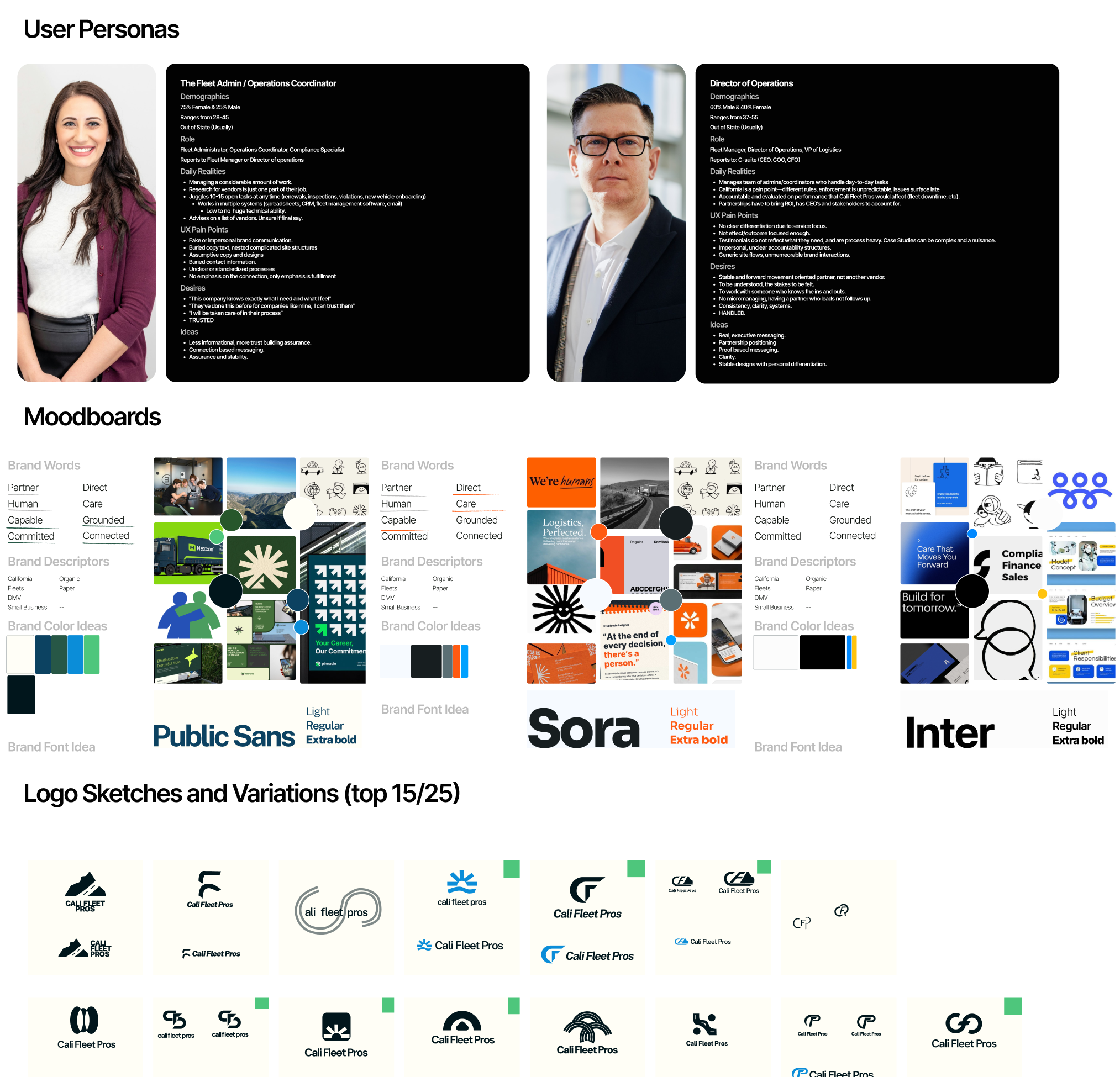
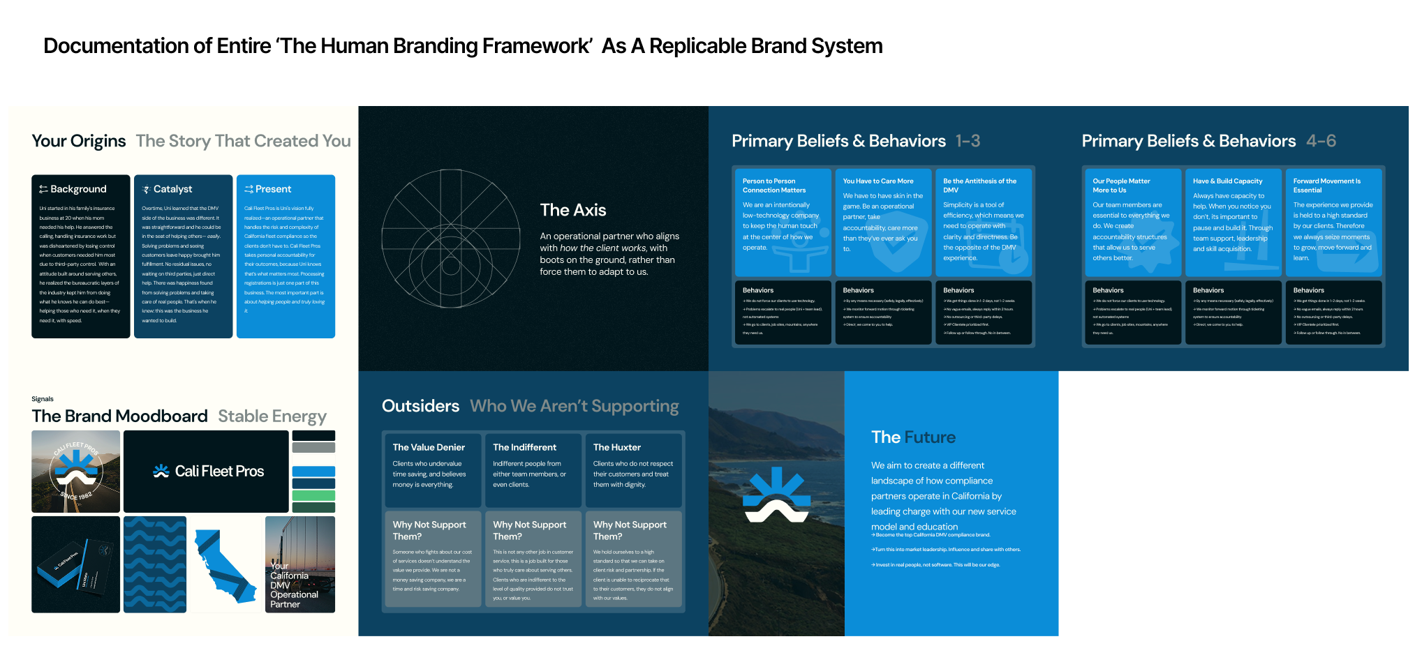
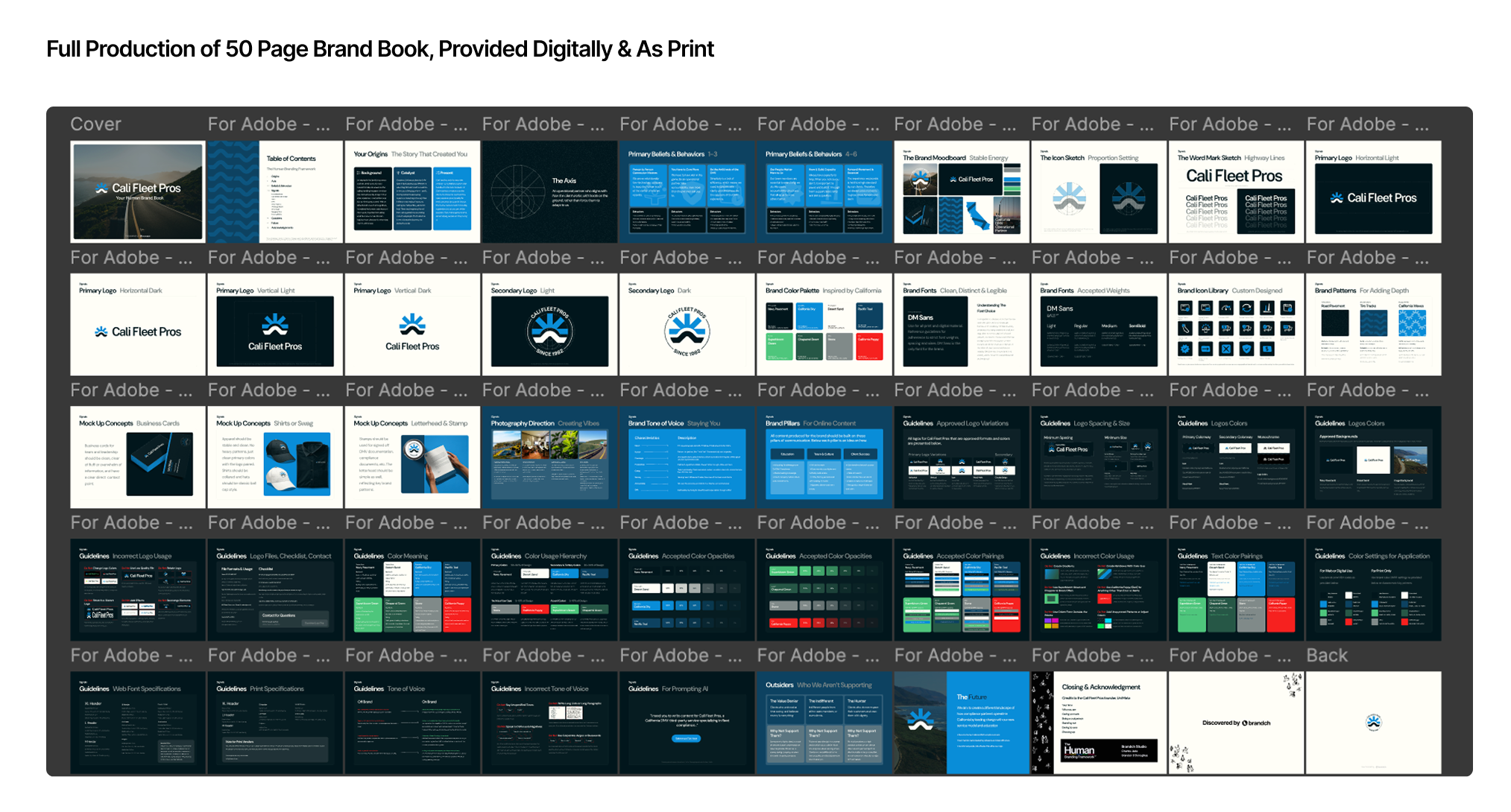
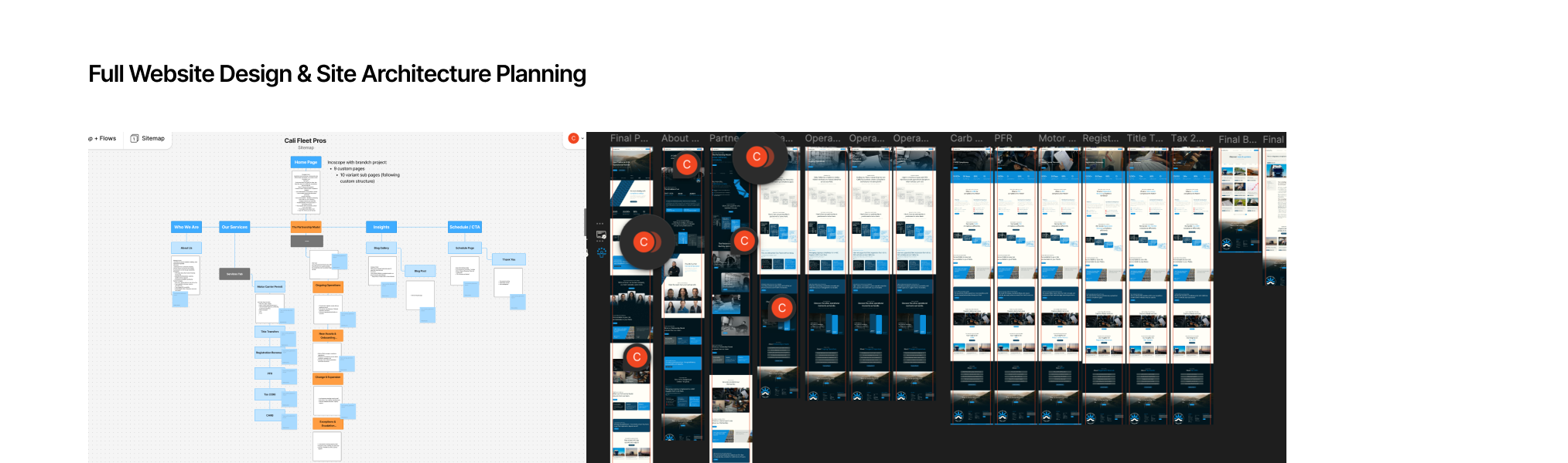
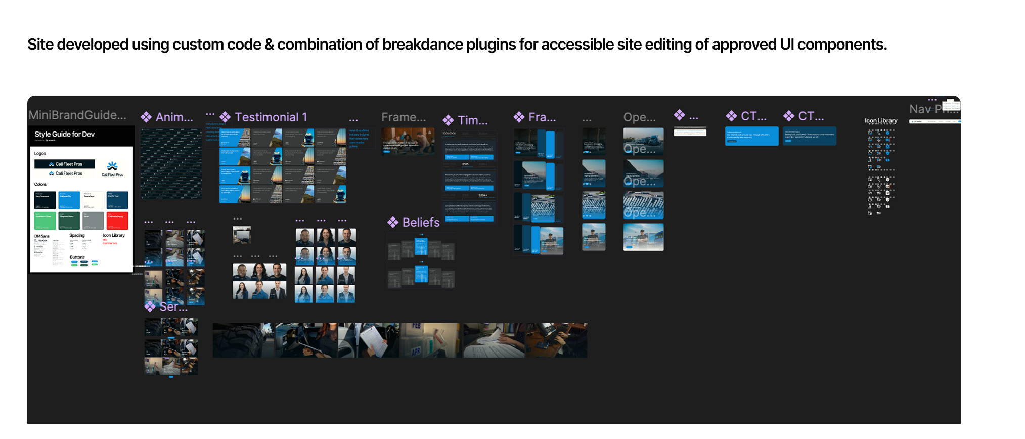
When navigating a brand that needs scalability, and a target audience of the largest companies in the world, it's important to consider the necessity of brand systems to follow to create stability and consistency on all business fronts. From internal messaging and brand story documentation, team culture, brand system guidelines, brand patterns and icon libraries, and future direction, we created a comprehensive system to encompass their present and future needs as they come to market.
Brand Book
The Partnership Model that the brand offers took careful crafting and planning. Starting with collaborated studies of user research and calls into operations, a model was landed on that created the structure and foundation of the experience of the brand. This is their axis, an operational partner with a human-touch.
Systems Design
Once the foundations of brand systems are laid, execution on a website becomes about turning it into something real, tangible and outward. Covering all essential pages and comprehensive site components. Development with clear components, assets and brand systems.
Website Design & Development
The target audience of the brand has a huge concern, their unseen blind spots and fees. We custom created a CARB fee calculator based on their USDOT numbers for their fleets to see if they are in compliance risk and how much fees they may owe already.
Custom Coded Calculators

Process Breakdown

Together with the founder we performed our key strategy and brand discovery call that informs and sets the stage for future production. Built on the way people connect, so that his business can feel as real to his audience as it is to him. Over three hours we discover key stories behind the brand, beliefs that function outwardly and use that to carefully inform the brand Signals that we create. For Uni, this call was transformative: "I never knew I had a story, I always thought it was just what the business does. It made me realize how special it is what I am doing. That call changed the way I think...", he shared later.
With a stable understanding of the brand and what it aims to do, we have to go straight to the market and understand it's complexities in order to ensure we make validated decisions. We first start with competitor research to see their performance, messaging and gaps. Then we move toward creating user personas informed by customer interviews to craft the language we use on the site and within the brand systems, this way we speak directly to them based on how they connect versus untested messaging. From there we create brand mood boards inspired by key brand words and phrases with different visual directions to help establish which position this company wants to take within the researched market.
After a brand mood board is decided upon, we move straight into execution of our logo process. This includes over 25 sketches of different logos and icons to ensure we cover a multitude of possibilities with freedom and curiosity using multiple brand words or visual signals. From there we internally decide on a top 4-6 contenders and create an anonymous user feedback survey for an audience of 10 to provide their initial impressions of the brand with the prompt and the paired logo. What we're looking for here is perspective, the user may say it is negative that they see a California sun, but if the goal is to impress California upon them, then we mark outcomes documented to help validate which logo direction we take. It all starts with a founding thesis that the brand will sit upon, and which impression aligns the best with it. This allows the client to make final decisions on logo direction based on data and goals, versus merely aesthetics alone. We then review it within a presentation with the client, and they decide upon the logo direction they want to go.
When a final logo contender is chosen, then we transition into logo refinement. It's important to note that logo variations reviewed prior for the client are reviewed on the basis that they are unrefined directions, to ensure we protect the final outcome from endless revisions we decide on direction first. With this contender being chosen for having the desired impression on the audience, we transitioned into finding a proper proportions and dual tone to create a final refined version. This logo is an inspired mix of California sun and oceans, a fleet tire spoke and hub, as well as a road. Merging these visuals together ensures that without being too literal, the brand has an icon and signal to stand behind that impresses upon the audience clearly.
Transitioning into brand systems and documentation from logo refinement adds a good pause period on visuals to ensure they are backed by true brand values and direction. We create the founding pages of the brand book that have to do with internal messaging, beliefs, behaviors, outsiders and future so when we begin on the final decision making for visual systems, we reference internal systems we want to reflect outwardly. Such as the operational Partnership Model and its unique characteristics for his customers.
This client needed a full comprehensive brand book with usable systems and instructions for it. We use this time to create different logo variations, custom brand logo fonts, secondary logos as requested, color pallets informed by California landscapes and more. Designing brand patterns, giving direction on photography, designing a full brand icon library from scratch, and comprehensive guidelines to ensure this system has clear boundaries to keep every touch point branded as it should be with consistency. When combined with the system documentation, you create a full brand book versus an asset that only focuses on visuals. It is the full business document.
Having the brand book and systems prepared before website design is a helpful step in ensuring the website can reflect and test the brand book. We use it as an opportunity to not only create designs, but stress test the guidelines. Covering standard pages, to unique Partnership Model pages and standardized landing pages, we executed on a custom designed website within Figma with clear components and assets for the development team to execute upon .
During development, it is important to document each component or dynamic asset clearly for future content creation within the website. Our team carefully turned designs into a live asset that can be tested and revised upon easily. Doing this during the design phase ensures that our decisions are informed based on what functions, versus what looks good only in a file. The development team also created an idea for and worked on a custom tool for the client, the CARB calculator. This unique tool takes USDOT numbers and the county compliance laws, as well as other unique data points to help Cali Fleet Pro's customers look up their estimated exposure risk and fines for free. At brandch, it is important for designers and engineers to collaborate equally and create unique ideas equally that support the brand direction.

Up Next

Service Business
Cascade Natural Gas Corp
One of the largest natural gas corporations in the nation seeks to turn the northwest into a green energy hub.

Advertising

Animation

Video

My experience with Brandch has been nothing shy of excellent. They are professional, polished, and results-driven, but in my opinion their greatest asset is their seemingly limitless creativity.
Abigail Bradeen,
Gravity Jack.
What stood out most? They really listened. Not only did they grasp my vision, but they also offered insightful suggestions that elevated the project in ways I hadn’t considered.
Robert W. Henry, Haven Realty Owner & Lifecoach
Their attention to detail is unmatched and the end result was A1.
Juandiego, Rep. of CNGC
Their team's professionalism, creativity, and dedication to a variety of strategies have exceeded our expectations.
Mark Buche, Gravity Jack
Read Our Google Reviews
My experience with Brandch has been nothing shy of excellent. They are professional, polished, and results-driven, but in my opinion their greatest asset is their seemingly limitless creativity.
Abigail Bradeen, Gravity Jack
What stood out most? They really listened. Not only did they grasp my vision, but they also offered insightful suggestions that elevated the project in ways I hadn’t considered.
Robert W. Henry, Haven Realty Owner & Lifecoach
Their team's professionalism, creativity, and dedication to a variety of strategies have exceeded our expectations.
Mark Buche, Gravity Jack
Their attention to detail is unmatched and the end result was A1.
Juandiego, Rep. of CNGC
Read Our Google Reviews